
Spatial Branding Is Turning Offices Into a Company’s Most Powerful Storytelling Tool
The conversation about the value of the office has matured considerably since the early return-to-work debates, when the argument centered almost entirely on collaboration and proximity. Companies have grown more sophisticated about what they are actually asking the office to do, and the list goes well beyond a place where people work alongside each other. The office is increasingly understood as a physical expression of what a company is, what it values, where it came from, and where it is going. That understanding has created a growing discipline inside architecture and interior design called spatial branding, the practice of translating a company’s brand narrative into material expression and atmospheric detail, so that the environment itself communicates identity rather than merely containing it.
The approach requires a fundamentally different starting point than conventional interior design. Where traditional workplace design begins with function, how many people need to sit, where the conference rooms go, how circulation flows, spatial branding begins with meaning. What is the story this company needs to tell? What does the physical environment need to make someone feel when they walk in for the first time? What should an employee understand about where they work just from moving through the building on an ordinary Tuesday? Answering those questions well demands research into the company’s history, its values, and the audience it’s designing for, whether that’s clients, recruits, or the employees who will spend the most time inside.

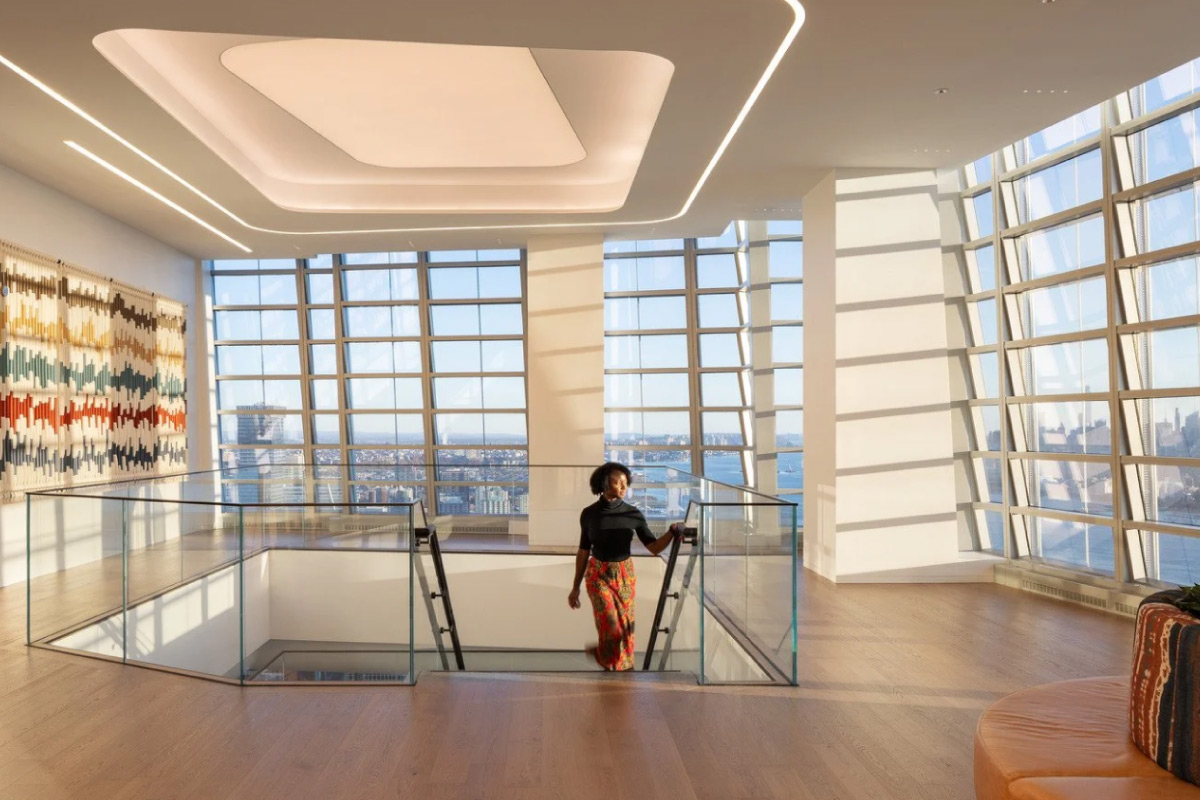
One of the most direct tools for that kind of storytelling is the use of archival material and commissioned art. When HLW was engaged to design the new 178,000-square-foot headquarters for Lord Abbett, the independent investment management firm celebrating its 95-year legacy, the design team reached deep into the company’s history to find the visual raw material for the space. “We found old imagery from their archives and gave them a creative tone to help make them a powerful part of the office atmosphere but also a connection to the company’s roots,” said Tyler Lowe, Environmental Graphic Designer at HLW. The result was a series of super graphics that blended abstract patterns, archival documents, and contemporary visuals across all five floors of the headquarters, including an artistic juxtaposition of 1980s imagery and binary code on the 36th floor and a magnified scripophily pattern from a historic stock certificate on the 40th. A Heritage Library celebrating the firm’s 95-year history features archival materials, financial certificates, and interactive digital displays, while artist Suzanne Tick wove a sculpture using recycled dry-cleaning hangers, Lord Abbett shredded ledgers, and mylar balloons, reflecting the firm’s commitment to sustainability and innovation. The result is an office that feels unmistakably modern but steeped in tradition, a balance that is particularly meaningful for a firm whose longevity is itself a competitive differentiator in the asset management industry.
Wayfinding is perhaps the most underestimated dimension of spatial branding, because it is simultaneously the most functional and the most expressive. Every building requires people to navigate it, and the system that guides them through it is a design decision that carries enormous expressive potential. “We have to think about where the occupants are going to have to figure out where to go,” Lowe said. “How do we make this intuitive but also connect it to the brand?” At Lord Abbett, the answer was a color-coded wayfinding system built directly out of the firm’s brand palette. Each of the five floors was assigned a distinct hue, Dark Teal for the 36th, Rust for the 37th, Teal for the 38th, Brass for the 39th, and Dark Bronze for the 40th, with the two uppermost client-facing floors treated as “jewelry” using metallic finishes to convey sophistication. The color palette was extended into the stairwells as vibrant graphics designed to promote movement and reinforce community across floors. The system does more than help people find their way. It becomes a memory structure, giving each floor a distinct identity that employees and visitors internalize and use to orient themselves spatially.
HLW’s work for Subway shows how the same wayfinding logic plays out very differently depending on the brand being expressed. The Miami headquarters spans 64,000 square feet across two and a half floors and is subdivided into six distinct neighborhoods named for different food adjectives, each differentiated by its own sleek and playful graphic branding scheme. Each scheme brings the unique brand experience of Subway into every detail of the environment, including backsplash tiling, custom lighting, and floor and window laminates. As users move through the space, the primary brand is gradually peeled away and an entirely new visual style is introduced, showcasing Subway’s colors, patterns, and ingredients in sequence. At the Shelton, Connecticut headquarters, HLW’s brandx studio developed wayfinding and branded signage using words, phrases, and food-themed pictograms in vibrant on-brand colors, keeping the two geographically separated locations aesthetically connected. Ingredient-inspired elements and signature Subway Green and Subway Yellow run through both spaces from the moment someone steps through the door, creating immediate brand immersion rather than a neutral corporate lobby.

The most architecturally sophisticated application of spatial branding involves designing the circulation sequence of a space so that moving through it in a particular direction becomes a narrative experience. Some offices are now laid out so that people are naturally led through space in a way that unfolds a story chronologically, with the visual language and motif shifting as they move through different zones to signal that the story is evolving. “We have projects where people are guided through the space in a certain direction,” Lowe said. “That helps us tell a story in a chronological way.” Lord Abbett’s headquarters uses exactly this approach, with a carefully curated visitor path that weaves through framed moments and layered design elements, immersing guests in the firm’s story as they move toward the trading floor at the top. The environmental graphics system is not decorative overlay. It is navigational infrastructure that also carries meaning, using spatial cues to help occupants orient themselves and understand where they are in relation to the larger story the company is telling about itself.
What all of these projects point toward is a shift in how corporate real estate is being understood at the strategic level. The office is no longer evaluated purely as a cost per square foot or a headcount accommodation. It is being designed as a brand asset in the same way that a product launch or a retail environment is, with the same attention to the experience of the person moving through it and the same intentionality about what impression they should leave with. Environmental design systems are increasingly being built not just to communicate brand presence but to actively support orientation and memory through spatial cues that work below the level of conscious attention. A color-coded floor plate is navigational. A historical photograph scaled to fill a wall is emotional. A neighborhood named for a flavor is playful and brand-reinforcing simultaneously. The companies that understand how to integrate all of those layers into a coherent spatial experience are discovering that the office itself becomes one of their most effective tools for attracting talent, impressing clients, and building the kind of culture that doesn’t come from a values statement on a website.
The post Spatial Branding Is Turning Offices Into a Company’s Most Powerful Storytelling Tool appeared first on Propmodo.